
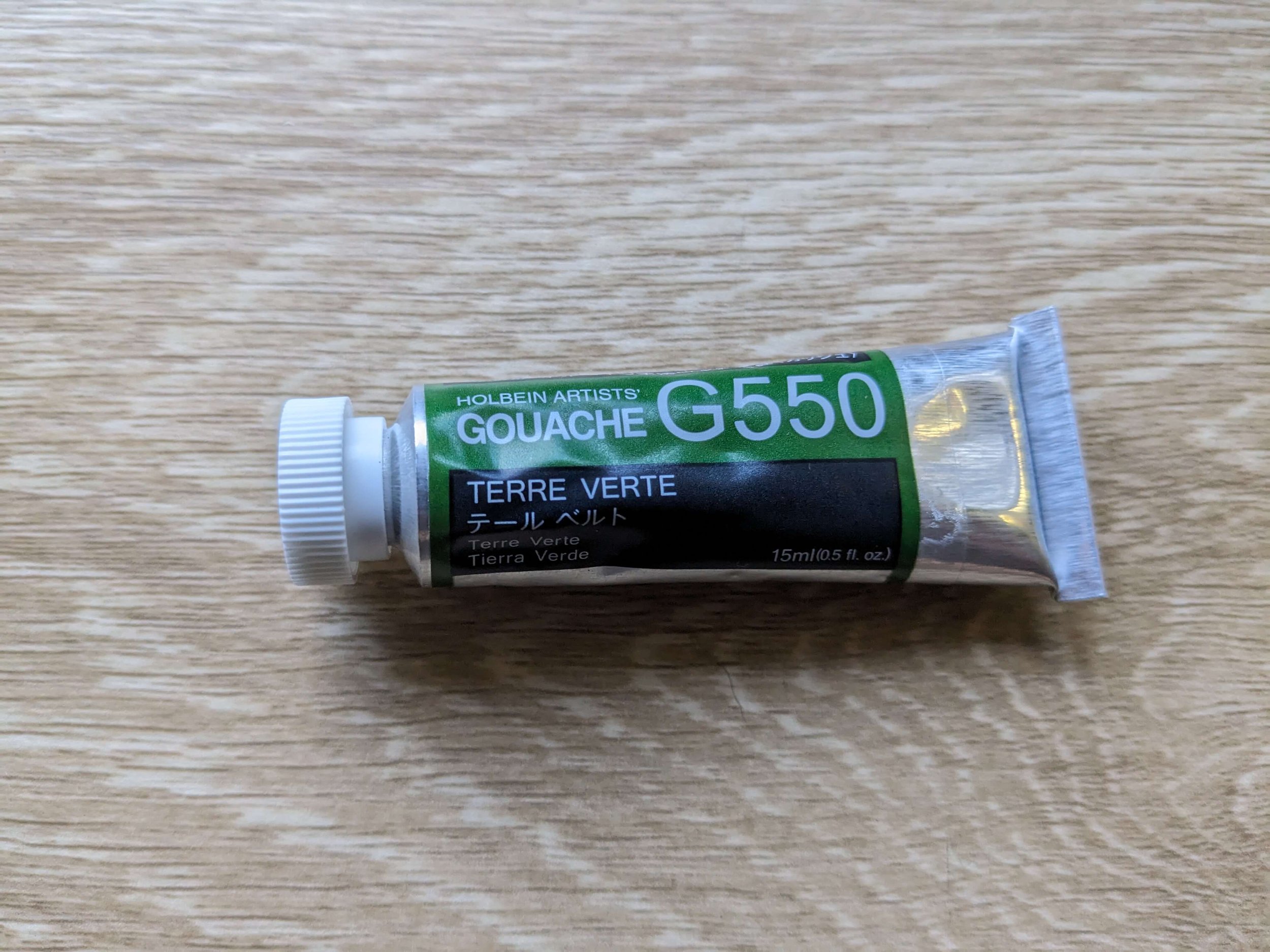
Holbein Artists’ Gouache Terre Verte Swatches
Looking for a Natural Looking, Lightfast Convenience Green
For now, this is a quick swatch and mixing post, but I’ll keep adding to it once I’ve played with this colour more and have more complete thoughts on the usefulness of this colour. A general note that the colours may look different based on your screen and display settings as well as various lighting conditions. I’ve tried my best to show what the colours look like in daylight where I am.
I’ve been looking for a good, lightfast convenience green from the Holbein Artists’ Gouache range for some time. I normally like to mix my greens, but it is nice to have a convenience mixture sometimes. While Holbein’s range has many greens, I was looking for a natural, lightfast green. Here the options are more limited. It was this one or Cadmium Green Deep. I picked Terre Verte because it is in their A series and therefore a lot cheaper than Cadmium Green Deep. From their digital colour chart it also looked a bit less dark than Cadmium Green Deep, and hopefully therefore more it will be more useful to me.
The Pigments
Terre Verte contains PG17 and PG23 or Anhydrous Chromium Sesquioxide and Native Green Earth according to Holbein’s Technical Data Sheet. I have used a paint with PG17 in it before - Winsor and Newton’s Chromium Oxide Green Designer’s Gouache and did like it but I prefer the texture of Holbein’s gouache.
Swatches and Mixes
When I was looking for an idea of what this paint looked like and could do, I wasn’t able to find much, so here is just a page I’ve put together with swatches and some mixes.

Why mix with these colours? For Gouache, these are the colours I’d always have in my kit (or something similar). If you’re not familiar with gouache, I’ve listed the reasons for mixing with these colours below.

The top left is the swatch in mass tone, top right is the paint watered down to what it would look like used like watercolour.

The second row is Terre Verte mixed with Primary White and Primary Black.
Primary White - PW 6 (Titanium White) - a bright white that is very useful for not only adding opacity to colours, but also lightening them to create a range of values. Essential for gouache.
Primary Black - PBk 7 - great for creating darker colours although, often a nice dark brown will create more dynamic mixes. That said, this colour comes in the affordable/value for money Holbein Gouache Primary Set so I always have it with me.

The third row is also Terre Verte mixed with Primary White on the left but a bit less white. The colour on the right is Terre Verte mixed with Zinc White (PW 5).
Zinc White - PW 5 - also adds opacity, is slightly warmer than a Primary/Titanium White, but does not shift the colour of what you’re mixing it with as much. Great when you just want a colour to be more opaque and look uniformly flat when applied.

The fourth row contains Terre Verte mixed with each of Primary Cyan, Primary Yellow and Primary Magenta from the Holbein Gouache Primary Set. I write more about that set here.
Primary Cyan - PB 15 - a cool blue. This together with Primary Yellow and Primary Magenta are my absolute must-have colours. I can make do with just the five primaries, although I do like to have other colours in my gouache kit for convenience. Creates nice and cool greens and here mixed with Terre Verte, makes a brighter, bluer green.
Primary Yellow - PY 3, 74 - a middle yellow. This has been a very useful colour, but as I’ll share in another post, I generally haven’t found there to be that much difference in the range of cool to neutral yellows I’ve tried at least in how they mix. This is just a great all round mixing yellow and here, added to Terre Verte adds a brightness and warmth to the colour.
Primary Magenta - PR 122 - a cool red. Essential in a Cyan-Magenta-Yellow triad. Mixed with Primary Yellow and Primary Cyan, it tones down greens. Given Terre Verte is already a natural-looking green, adding magenta turns it into a greeny-brown colour with a dull greyish tone

The last row is Terre Verte mixed with Gunjou/Ultramarine from the Holbein Irodori range, Remon/Lemon from the Holbein Irodori range and Vermillion Hue from Schmincke’s Horadam Gouache range.
Gunjou/Ultramarine - PB 29 - a warm blue. Makes more muted greens when mixed with yellow. Ultramarine is often included in a split primary palette (warm yellow, cool yellow, warm blue, cool blue, warm red, cool red). I usually have at least one warm blue in my set as it is useful for more toned down green mixes and for bright purples. Here it turns Terre Verte more blue and duller.
Remon/Lemon - PY 3 - a cool yellow. Noticeably cooler in colour than Primary Yellow, and mixes a brighter green than the Primary Yellow when mixed with blues and with greens including Terre Verte.
Vermillion Hue - PR 255 - a warm red, and one of my favourite pigments. Creates bright beautiful oranges. Similar to Primary Magenta, it neutralises greens. Here it creates a warmer greeny-brown when compared to the grey tone that the Primary Magenta creates.
Mixing with this set of colours gives me a good idea of the range that a particular paint can produce.
First Impressions Review
Having used it in two paintings so far, as well as doing a bunch of swatching, playing and testing pages, my first impressions are:
It is very opaque, which I have come to expect from most of Holbein’s range however some colours are just less opaque because of their pigments i.e. PB 15 in Primary Cyan, so I usually have to add white to my greens that I mix using Primary Cyan. I’m already loving how opaque Terre Verte is straight out of the tube.
The consistency is similar to other Holbein gouache, so if you like it, you’ll like this, but if you don’t like Holbein and how it works, you won’t. I’ve tried some Winsor and Newton, Schmincke and Art Spectrum Gouache previously and while they mostly work fine, I keep coming back to Holbein because I like the consistency. Here in Australia, it also helps that it is cheaper than most other gouache brands (other than Art Spectrum).
The colour is a bit cooler than I expected, but so far, it seems fairly useful. I can see it being really useful for a wide range of greens from the bluey greens to muted olives that I often see in Australian plants. It also seems useful for dark rainforest greens. It will however need punching up for the more vibrant tropical greens.
More to Come
I’ve only just begun playing with this colour, and I’ll add more as I keep playing and experimenting with it in my paintings. I’m hoping it will end up in my lightfast stash but I’ll admit that there are other (less lightfast) greens I personally like better in the Autumn and Winter Irodori sets I’ve recently treated myself to. I’ll write more about them and compare various greens down the track too.
For now, if you’re considering Terre Verte or just looking for a lightfast natural green from Holbein’s range of traditional gouache, I hope this post has helped.