
Painting Double-Barred Finches (Alphabet Superset Project Part 4)

Part 4: D - Double-Barred Finches
Hello! If you’ve been following my Alphabet Superset Project, welcome back. If this is your first time here and you have no idea why this is part 4, and what the Alphabet Superset Project is, the first post in the series might help. But also, here is a quick recap:
For the next few months, I will be painting an Australian animal or an animal that visits Australia that I’ve seen and preferably one I have my own photos of. I’m doing this as part of a project/challenge called the Alphabet Superset, the brainchild of Youtuber (among other things) Campbell Walker aka Struthless. My main reasons are to have a consistent means of slowly painting all the wonderful animals I’ve been lucky to see while we’d been camping around Australia in 2021 and 2022 (with a short stint in Darwin).
To find out more about the project, the best source is the Alphabet Superset page itself or Campbell Walker’s video about it.
To find out more about why I am doing this project, check out the first post in the series here. To see more of my paintings as part of this challenge, you can search for Alphabet Superset on this site or click on the Alphabet Superset category here or above.
Now, here’s part 4: Double-Barred Finches!
What are Double-Barred Finches?
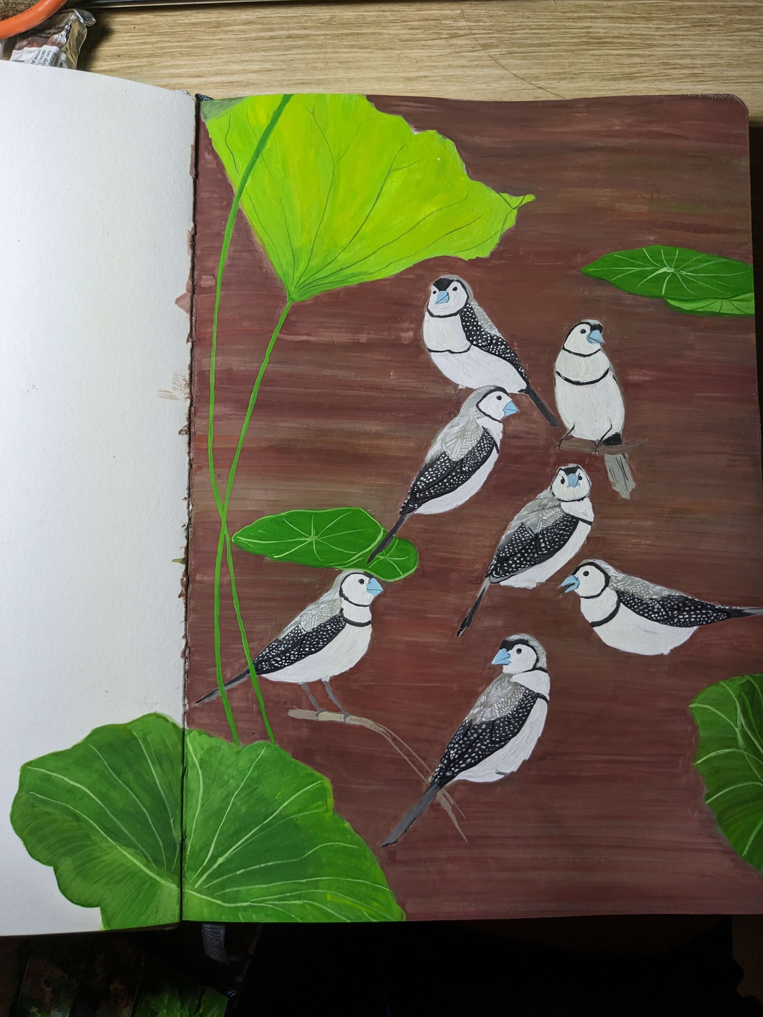
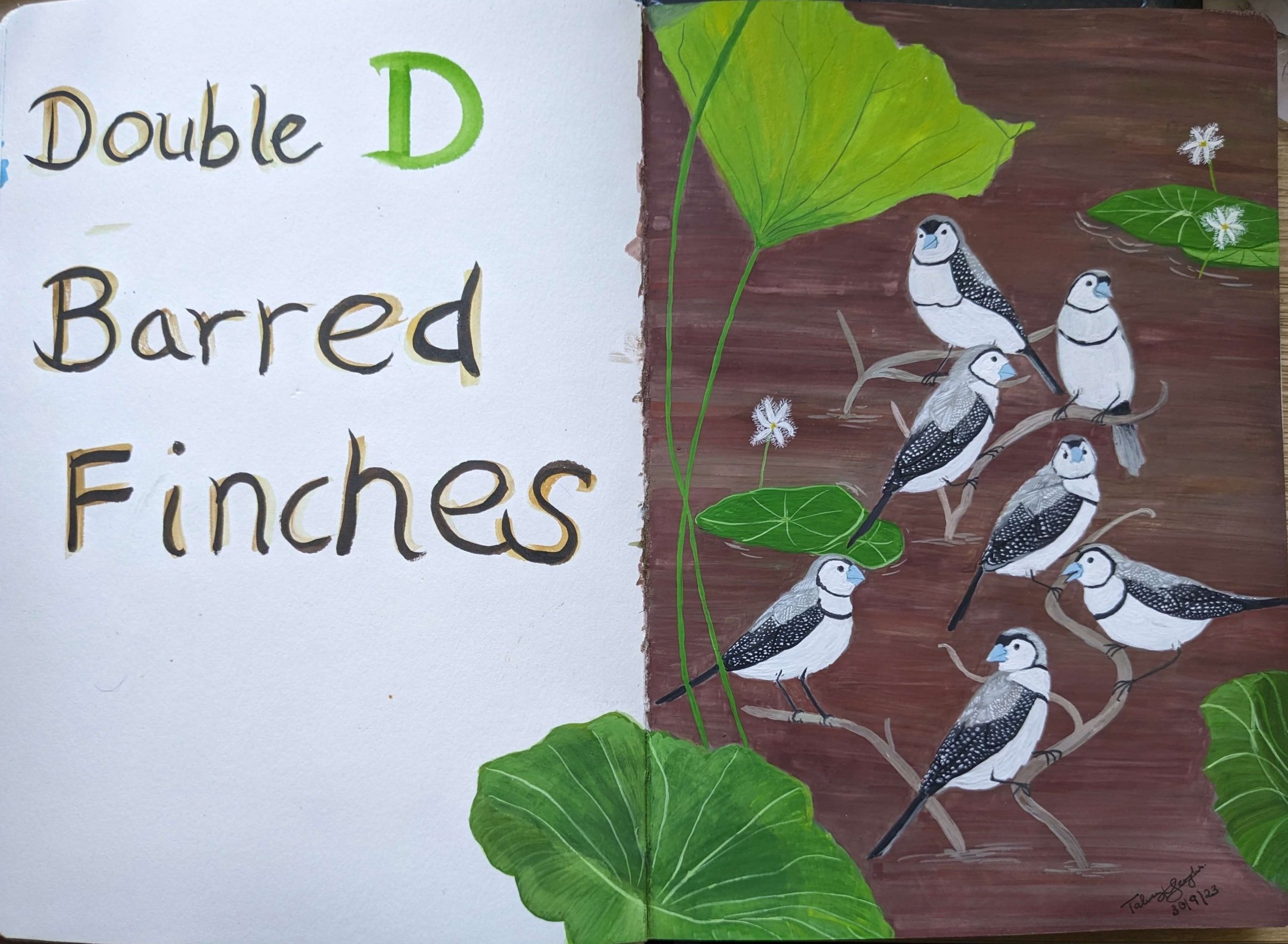
Double-barred finches are small birds, and if you’ve ever seen any kind of finch, these have the same beak shape. They are mainly white, grey and black with a pale blue beak. They have a white face and belly, grey head, back and wings. Their black markings are what makes them quite distinctive and its hard to mistake them for anything else. Double-barred finches, have two distinctive black bands on their chest. The top one connects to frame their faces as well.
They also have black tail feathers and outer wings. The outer wings are even more distinctive because of the white tiny dots/dashes on the black parts of their wings. It was these dots that first caught my eye when I saw them in a Darwin carpark for the first time. We then saw them in Kakadu National Park and Mary River National Park in the Northern Territory, at Parry Creek in Western Australia as well as at Ellenbrae along the Gibb River Road amongst many other spots along our walks. Unlike Zebra finches further south though, we never really saw that many in one place.
That said, you’d think having seen them that many times, this week would have been a breeze, but it was actually one of the hardest so far (read on to Process parts 4-6 to find out why).
References and for more information about the Double-Barred Finch:
The Australian Bird Guide, 2019 revised edition, CSIRO Publishing, (click here for my blog post about the bird guide)
Why Paint them?
Finches in general are some of my favourite birds to paint and watch. They’re all quite tiny, squat, chubby and cute. Watching them flit around provides endless entertainment.
I didn’t really have that many other D animals I wanted to paint. I’d still like to paint a dingo at some point, but the photos I have aren’t the best, and when compared to the double-barred finch, the double-barred finch felt like it’d be a lot more fun to paint. I also couldn’t believe I hadn’t painted it yet given I painted a few of the finches we’d seen in the territory at the end of last year/early this year.
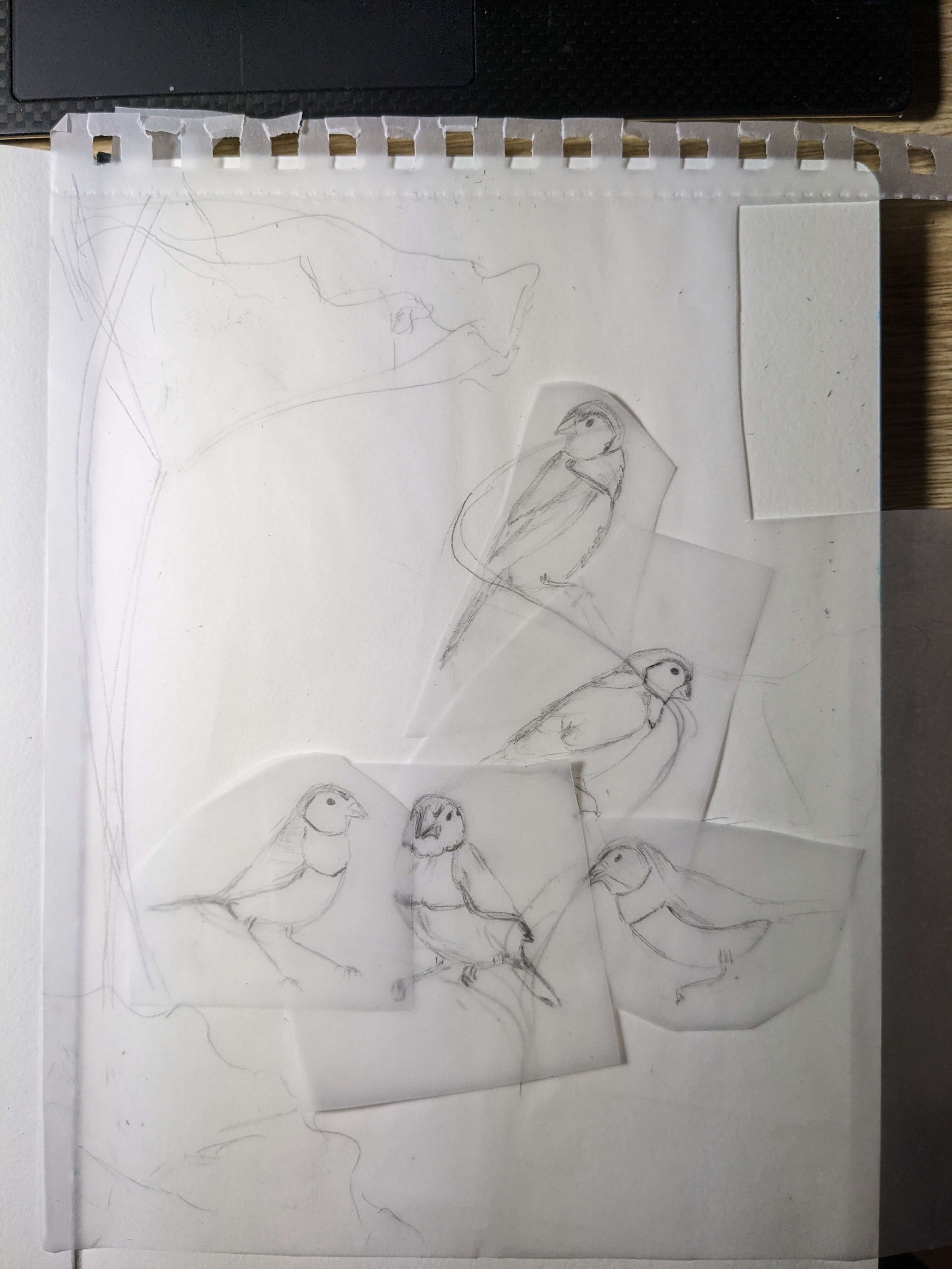
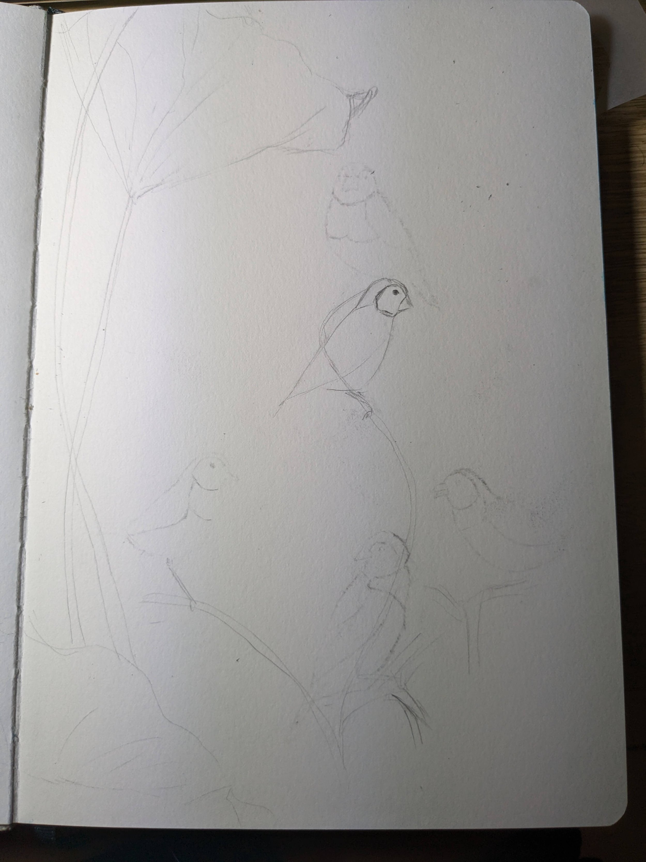
I’d sketched double-barred finches while watching them at Ellenbrae Station in Western Australia but never got around to painting them. This painting was long overdue.
Process - Part 1: Find Photo References, Sketch
I had a few good photos of these finches courtesy of Scott and some of my own photos. Scott had taken some good ones at Lee Point in Darwin (honestly an amazing bird lover’s spot), as well as some brilliant ones amongst the lillies and lotuses at Mary River National Park. I had some good ones from Ellenbrae Station and we both managed to get some decent photos at Parry Creek in Western Australia.
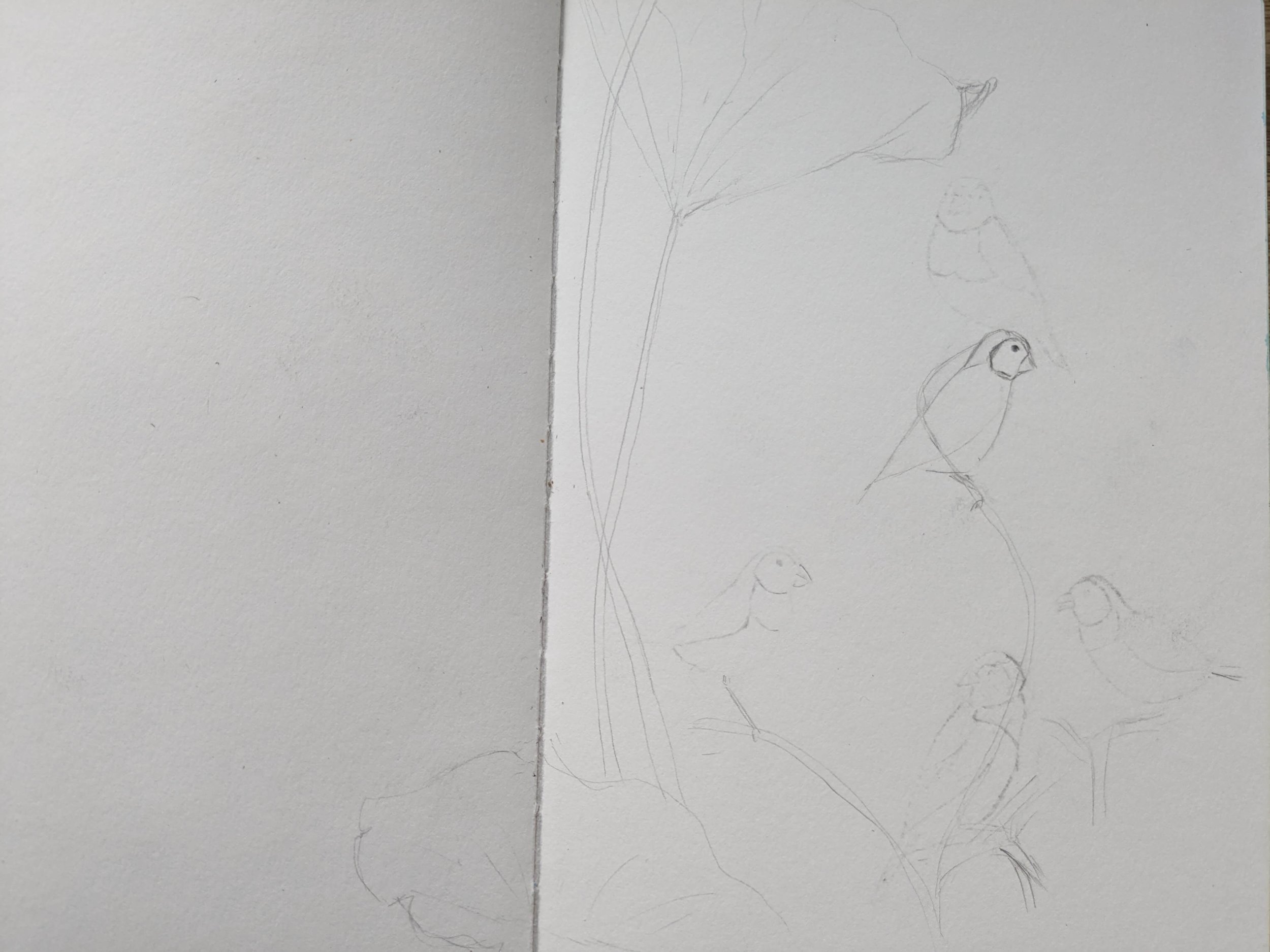
My problem here was that I really wanted to show them in a natural, wild setting and a lot of the photos we had were not that. Easier to take good photos when they’re at a bird feeder (Ellenbrae), or a bird bath (Parry Creek) or at a water sprinkler (Lee Point), but the only natural setting photos I could find of them were Scott’s photos of the birds among mud, lotuses and lillies of Mary River National Park or amongst some branches also at the Mary River National Park.
I liked the oddness of seeing the finches in a very wetland setting so that’s what I went with.
Process - Part 2: Work out Colours, Paint the Background

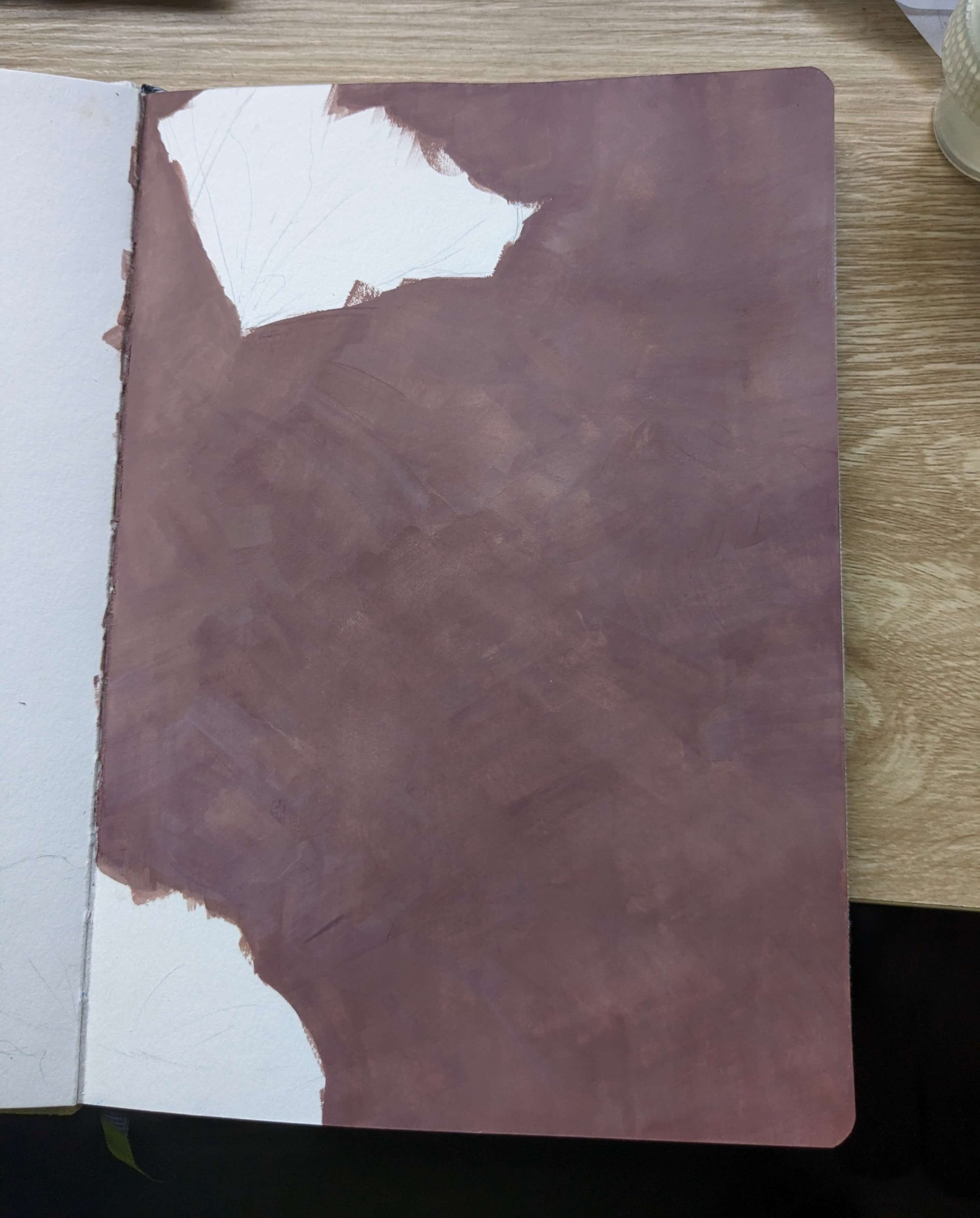
Rough testing colours and which ones might look good in the background with the finches.
Similar to last time, I used a ridiculous number of colours (compared to my normal process/colours) because I wanted to test out my new Holbein Irodori Autumn and Winter sets. I tested what sort of colour scheme I’d like and that would contrast well with the finches but beyond that, the colours were much more intuitive choices. Looking at my previous post, the colours I used here were quite similar to last time but there were fewer greens and more browns in this painting. I’m loving the gorgeous natural colours in these sets so far. Rikyuunezu / Rikyu Grey in particular has been very useful.
After testing a few colours, I really liked the look of the Azuki/Russet Brown colour so decided to do the whole background in this colour but with random strokes to create some texture in the background.
This is not the background I ended up with though, and I go over what happened in Process part 4-5 later in this post.

The main colours I used/tested in the background were:
Azuki/Russet Brown (Holbein Irodori Artists’ Gouache) - I love this colour!
Susutake/Smoked Bamboo (Holbein Irodori Artists’ Gouache)
Kogecha/Dark Brown (Holbein Irodori Artists' Gouache)
Bengara/Iron Oxide Red (Holbein Irodori Artists' Gouache)
Hiwada/Bark Brown (Holbein Irodori Artists' Gouache)
Rikyuunezu/Rikyu Grey (Holbein Irodori Artists’ Gouache)
There were also hints of:
Moegi/Leek Green (Holbein Irodori Artists’ Gouache)
Kohaku/Amber (Holbein Irodori Artists’ Gouache)
Oudo/Light Ochre (Holbein Irodori Artists' Gouache)
For the birds I used:
Rikyuunezu/Rikyu Grey (Holbein Irodori Artists’ Gouache)
Primary Black (Holbein Artists’ Gouache)
Primary White (Holbein Artists’ Gouache)
and a hint of some of the browns on my palette to give the black some depth
For the leaves I used:
Moegi/Leek Green (Holbein Irodori Artists’ Gouache)
Senzaimidori/Pine Tree Green (Holbein Irodori Artists' Gouache)
Kihada/Amur Cork Yellow (Holbein Irodori Artists’ Gouache)
Kuchinashi/Gardenia Yellow (Holbein Irodori Artists' Gouache)
For the small white lillies (I believe these are Nyphoides indica or Water Snowflakes):
Primary White (Holbein Artists’ Gouache)
Kihada/Amur Cork Yellow (Holbein Irodori Artists’ Gouache)

Again, I would not normally use this many colours. You definitely don’t need them, but I would not have been able to achieve the beautiful colours in the background without them (and making a lot of mistakes I had to then cover over).
I also have to mention that there is absolutely no way I would have gotten the detail on the finches, the tiny lilly hairs and the veining on the leaves if not for these two brushes:
Princeton Velvetouch Spotter 5/0
Princeton Velvetouch Liner 20/0
Process - Part 3: Start Painting the Double-Barred Finches
This was a ton of fun! I absolutely loved painting the finches and it was probably the easiest part and when the painting started taking shape.

The first thing I did with the birds was I had to repaint/sketch them because I’d painted over my initial sketches with the Azuki first background layer. Luckily I’d made a tracing paper sketch of my full composition. That said, I still needed to adjust the proportions of a few of the birds, and add a couple more.

Process - Part 4: Adding Details, Background Again for More Interest, Making Mistakes
Once I’d done the finches, everything looked a bit flat and I didn’t know what to do to make the composition feel a bit more dynamic. I asked for a bit of help from Scott, looked at some of the photos for water and tried adding a bit of reflection and water indicators as well as some dried/dead leaves and some grasses. I tried to work this out on the iPad first (I’ve been giving Procreate a go, for now I’ve mainly been using it to test out things before painting them but I’m hoping to learn more about this app soon.)

Procreate test, adding some extra details.
I thought the above additions would work better than they did. I loved painting the details on the birds and it was so satisfying to see the little dots on their wings. That was my favourite part of this painting - getting the birds right. What I did after adding details to the finches however, almost ruined the painting.

I had done way too much to this by this point. The problem was that I was not clear on the final composition before I started.
As you can see above, I properly cluttered it and because I was trying to work around the birds, I didn’t have enough space to really blend to create a good water approximation. It all just ended up looking like a real mess. Instead of deciding to go back to the drawing board, I managed to make an even bigger mess by doubling down on the water aspects. See the near disaster below.

Even more of a mess. I’m sure the water could have worked but I really needed to have decided to do that right from the start, before I added anything on the background.
At one point I was considering just cutting out the birds and starting the background again on a new page. Why am I sharing all this? Because painting can be fiddly, and I think it is absolutely worth seeing the mistakes made by others to avoid them yourself, but also to know that it happens, everyone does it. It doesn’t matter that I’m not new to gouache anymore.
Sometimes I try things I should know better not to. I.e. don’t muck around with the background once you’ve got a lot more happening on top of it.
Anyway, after much deliberation and disappointment at the mess I’d made, I decided to go back to the drawing board.
Process - Part 5: Fixing Issues I’ve Created, Refining
The solution I had in mind was to just go over and create a more dynamic background that didn’t necessarily have to look like anything in particular. Just make it nice I thought, so I got out more of the various browns, and added some Bengara/Iron Oxide Red to them to add some life to them as well as a bit of Rikyu Grey and started painting using horizontal strokes this time to get some interesting effects happening. The only things I wanted to keep safe were the birds and the larger leaves I’d painted that I liked.
Painting finally looking like it was getting to a decent point again.
I was extremely relieved that the patience and persistence paid off and the background was finally looking ok again. There did come point where I knew I could not layer any more. Every stroke was lifting colours a few layers down. So I just smoothed things out as well as I could and left it.
Luckily the multiple layers, and various layers blending together actually created an unintentionally nice effect to my eye anyway. A few flat lily pads with illustrative water ripples later, I was feeling much happier about this painting, but something still wasn’t quite right.
On the iPad again, I tried adding some Water Snowflake little lillies that we’d seen in so many wetland waterholes in the north. It looked great, so a couple of little Water Snowflake lillies later, the painting was done. These completed the piece and I was finally happy with it.

Testing out where to put the little lilies using Procreate on the iPad.

Finally, I’d managed to bring it back to a point I was happy with. I may try to play with it further digitally down the track, but as a gouache painting, this is where I’m leaving it.
Lessons Learnt
This was a massive slog and a desperate rescue mission for a mess I’d created. I’m so relieved the painting even exists, and just a little bit surprised that it is now my second favourite painting in this little series so far (the brolgas and black-necked stork from a couple of weeks ago is still my favourite piece).
Sometimes though, paintings like these do teach you a lot more than the ones that work out perfectly. Here I learnt/was reminded to:
Avoid painting/going back into any background after the foreground elements again.
Adding many colours and blending together layers can work really well. I may keep this happy accident and how I ended up creating in in my back pocket to try again sometime.
Keep trying - it is not done until it is done.
Try practicing a new type of background before actually painting it.
Be clearer much on the composition before starting.
Next Week: A bit of a break. Then, E: Emus and an Echidna.
It is rest week in this project, we’re going camping for a few days, and I have a separate piece I’m working on but, in the week of 9 October, I’ll be starting a painting of an Emu and an Echidna. Really looking forward to these too! We saw them right at the start of our camping journey over two years ago in Mount Remarkable National Park and the Ikara-Flinders Ranges in South Australia and they’ve been on the list to paint since.